Xây dựng Desktop UI cho alfaclub.app mà không phá vỡ mobile
Cách mình thêm desktop shell lên trên một Next.js 15 PWA mobile-first đã có. Route groups, parallel route slots, device-class cookie, và các quyết định về slot thực sự trụ lại.
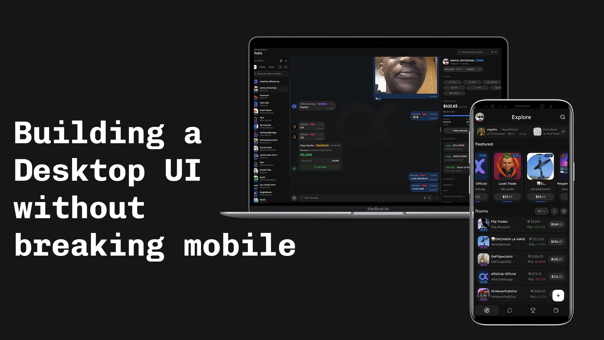
Cách mình thêm desktop UI vào alfaclub.app (trước đây gọi là Friendspace) lên trên một PWA mobile-first đã có. Stack: Next.js 15 App Router, React 19, Tailwind 4, shadcn primitives, Privy, Zustand, TanStack Query.
Muốn xem trước? Nhảy xuống demo trực tiếp ở cuối bài (walkthrough mobile + desktop).
Vì sao chúng mình làm chuyện này
Giai đoạn đầu, mọi thiết bị đều nhận thiết kế mobile-first vì chúng mình bị giới hạn thời gian. Người dùng desktop thấy layout phone bị kéo dãn ra. Không vỡ gì, chỉ là không phải một sản phẩm desktop. Sau một thời gian, dữ liệu traffic cho thấy một phần đáng kể người dùng active dùng laptop, đó chính là cái mở khoá quyết định để thực sự build cái này thay vì tiếp tục hoãn.
Các ràng buộc:
- Dưới breakpoint, không gì thay đổi. Mobile shell được tách ra nguyên trạng.
- Trên breakpoint, render một desktop UI thực sự (ngưỡng:
lg/ 1024px). Chrome khác, layout khác. - Cùng URL ở cả hai bên.
/rooms/abcmở cùng một room dù bên nào.
Responsive CSS không bridge được khoảng cách này. Shell khác (icon rail + topbar + persistent rails so với top bar + bottom nav), components khác (một chat room có thể nằm cạnh một persistent right rail trên desktop mà mobile không có), và persistent context mà desktop cho phép (một rooms list panel vẫn hiển thị khi bạn click giữa các room) không phải là thứ media query có thể tạo ra.
Next.js phát huy giá trị ở đây: App Router expose parallel route slots như một feature first-class của file system, nên mỗi rail trở thành một folder @left / @right, được SSR cùng với page mà không cần orchestration gì thêm. Cái này loại bỏ phần implementation cost lớn nhất.
Tách thành route groups, thay vì branch trong root layout
Bản năng đầu tiên: đọc cookie ở root layout, render đúng shell. Vấn đề là App Router không cho root layout biết route group hiện tại của request, nên không thể skip shell cho các auth screens.
Cách fix là hai route groups, mỗi cái có layout riêng:
app/
├── layout.tsx          # providers, fonts, html/body. NO shell logic.
├── (shell)/
│   └── layout.tsx      # picks DesktopShell vs MobileShell from a cookie
└── (full-page)/
└── layout.tsx # bare wrapper for login / invite / shareShell picker bản thân nó nhỏ gọn:
// app/(shell)/layout.tsx
export default async function ShellLayout({ children, right, left }) {
  const deviceClass = await getDeviceClass();
  if (deviceClass !== "desktop") return <MobileShell>{children}</MobileShell>;

  const defaultRightRailSize = await getRightRailSize();
  return (
    <DesktopShell
      left={left}
      right={right}
      defaultRightRailSize={defaultRightRailSize}
    >
      {children}
    </DesktopShell>
  );
}right và left là parallel route slots; chi tiết hơn ở section về cơ chế slot bên dưới.
Device-class cookie
Device class phải được biết ở server trước khi byte đầu tiên đi ra, nếu không user sẽ thấy flash sai shell. Browser không gửi viewport width, nên chúng ta đoán rồi để client correct sau.
// src/lib/device-class.ts
export const DEVICE_CLASS_COOKIE = "device-class";
export const DEVICE_CLASS_OVERRIDE_COOKIE = "device-class-override";

export function detectDeviceClass(input: {
  overrideValue?: string | null;
  cookieValue?: string | null;
  secChUaMobile?: string | null;
  userAgent?: string | null;
}): DeviceClass {
  if (input.overrideValue === "mobile" || input.overrideValue === "desktop") {
    return input.overrideValue;
  }
  if (input.cookieValue === "mobile" || input.cookieValue === "desktop") {
    return input.cookieValue;
  }
  if (input.secChUaMobile === "?1") return "mobile";
  if (input.secChUaMobile === "?0") return "desktop";

  const ua = input.userAgent ?? "";
  if (/Mobi|iPhone|Android(?!.*Tablet)|webOS|BlackBerry|IEMobile/i.test(ua)) {
    return "mobile";
  }
  return "desktop";
}Thứ tự quan trọng: override thắng stored cookie thắng Sec-CH-UA-Mobile thắng UA regex. Middleware chạy cái này mỗi request được protect và ghi lại cookie nếu khác, nên request kế tiếp skip luôn phần regex. Một URL param ?desktop=0|1|auto flip cái override và là escape hatch người dùng thực sự dùng (iPad portrait report là Macintosh nên bị classify sai; override là fix tạm cho tới khi mình wire Sec-CH-UA-Platform).
Hai cơ chế slot, cố ý: parallel routes cho rails, context cho topbar
Các rails theo route (/rooms -> rooms list + room info rail, /explore -> trending rail, v.v.) cần SSR. Topbar pieces thì không. Nên dùng cơ chế khác nhau:
- Rails (
@left,@right) là Next.js parallel route slots. File-system-owned, SSR cùng với page. - Topbar pieces (
topbarTitle,topbarEyebrow,topbarRight) đi qua một slot context (DesktopSlotsProvider+useDesktopSlot).
File tree của rails:
app/(shell)/
├── @left/
│   ├── [...catchAll]/page.tsx     # returns null
│   ├── default.tsx
│   └── rooms/...
├── @right/
│   ├── [...catchAll]/page.tsx     # returns null
│   ├── default.tsx
│   ├── explore/page.tsx
│   ├── leaderboard/page.tsx
│   └── rooms/[roomId]/page.tsx
└── default.tsxBa cái cắn mình, theo thứ tự thời gian mất:
Soft navigations cần một [...catchAll] sibling return null. Không có nó, navigate /rooms/123 -> /explore giữ lại slot cũ.
Hard navigations cần default.tsx ở mọi level, cả slot (@right/default.tsx) lẫn implicit children ((shell)/default.tsx). Thiếu là throw ngay khi hard nav.
Đừng gate rail visibility qua useSelectedLayoutSegment("right"). [...catchAll] sibling đôi khi thắng segment lookup so với nested dynamic page. Dùng pathname thay vì:
// src/lib/right-rail-routes.ts
const ROOT_SEGMENTS_WITH_RAIL: ReadonlySet<string> = new Set([
  "explore",
  "leaderboard",
]);
const ROOMS_RESERVED_CHILD_SEGMENTS: ReadonlySet<string> = new Set(["create"]);

export function hasRightRailForPath(pathname: string): boolean {
  const [top, child] = pathname.split("/").filter(Boolean);
  if (!top) return false;
  if (ROOT_SEGMENTS_WITH_RAIL.has(top)) return true;
  if (top === "rooms")
    return child != null && !ROOMS_RESERVED_CHILD_SEGMENTS.has(child);
  return false;
}Right rail dùng percentage, không phải pixel
Rail resizable, persist width. Cookie write nằm trong resize callback:
const persistRightRailSize = useCallback((layout: Layout) => {
  const size = layout[RIGHT_RAIL_PANEL_ID];
  if (typeof size !== "number" || !Number.isFinite(size)) return;
  document.cookie = `${RIGHT_RAIL_COOKIE}=${size.toFixed(2)}; path=/; max-age=${RIGHT_RAIL_COOKIE_MAX_AGE}; samesite=lax`;
}, []);

const handleLayoutChanged = useDebounceCallback(persistRightRailSize, 300);Cookie thay vì localStorage: server cần đọc giá trị này trong initial render để rail ra SSR đúng width.
Một cái cắn mất một tiếng: trong react-resizable-panels v4, bare number truyền vào minSize/maxSize/defaultSize bị hiểu là pixel. Muốn percentage thì truyền string:
<ResizablePanel
  id={RIGHT_RAIL_PANEL_ID}
  defaultSize={`${defaultRightRailSize}%`}
  minSize={`${RIGHT_RAIL_MIN_PCT}%`}
  maxSize={`${RIGHT_RAIL_MAX_PCT}%`}
/>Left rail không resizable; nó là một fixed-width column với state expanded/collapsed từ một Zustand store. Để nó nằm trong main panel của resizable group (thay vì làm group panel riêng) giữ cho percentage math của right rail ổn định khi left collapse.
Topbar slot pattern
Hook rất nhỏ:
export type DesktopSlotName = "topbarTitle" | "topbarEyebrow" | "topbarRight";

export function useDesktopSlot(name: DesktopSlotName, node: ReactNode | null) {
  const setSlot = useContext(DesktopSlotsContext)?.setSlot;
  useEffect(() => {
    if (!setSlot) return;
    setSlot(name, node);
    return () => setSlot(name, null);
  }, [setSlot, name, node]);
}Hai điều cố ý:
- No-op trên mobile. Context là
nullngoàiDesktopShell, nên call site không cần branch theo device. - Memoize
nodeở call site. Nếu không, một React element mới mỗi render sẽ loop effect (setSlot-> re-render -> identity mới -> effect lại fire).
Desktop search palette
Cmd+K là một search-and-jump dialog (rooms + users), không phải generic command palette. Build trên Dialog + Tabs + InputGroup; chúng mình không pull shadcn Command cho scope này.
// src/components/search/desktop-search.tsx (excerpt)
useHotkeys(
  "mod+k",
  (e) => {
    e.preventDefault();
    setOpen((v) => !v);
  },
  { enableOnFormTags: true, enableOnContentEditable: true }
);

const [debouncedInput] = useDebounce(input, DEBOUNCE_MS);enableOnFormTags/enableOnContentEditable bật rõ ràng: mặc định react-hotkeys-hook sẽ không fire khi focus đang ở chat composer, mà Cmd+K thì nên mở palette ngay cả ở đó. Modifier signal cái intent.
Khi input rỗng, dialog show một recent-nav list lấy từ một Zustand store (useRecentNavStore) để mở mới không phải màn trắng.
Component reuse policy
Desktop là chrome mới quanh các feature component đã có. Chat thread, message bubble, leaderboard row, explore feed item đều reuse nguyên. RoomsListPanel compose lại cùng building blocks; RoomRightRail là stack các section component nhỏ dưới components/desktop/rooms/room-right-rail/.
Rule quyết định "variant hay component mới":
- Delta nhỏ -> thêm variant với force mode. Nếu desktop chỉ khác mobile ở spacing, density, hoặc một subcomponent bị swap, thêm
variantvàocvaconfig của shared component, hoặc propdensity/compact. Phần quan trọng là force mode: caller phải pass đượcdensity="compact"thẳng để lấy được look chật ngay cả khi auto-detection không đề xuất. Escape hatch đó cho phép cùng một component render trong narrow desktop right rail HOẶC trong wider mobile drawer mà không ai phải fork. - Layout thực sự khác -> component mới trong
components/desktop/<feature>/. Empty state khác, sections reorder, data shape khác, mental model khác. Shared feature components vẫn là source of truth cho behavior; file desktop compose lại.
Rule cứng khác: install missing shadcn primitives bằng CLI, không tay viết. Phase 0 chạy npx shadcn@latest add sidebar kbd avatar breadcrumb sheet. Primitives tự viết tay sẽ drift.
Rollout và observability
Không phải cutover. Hai escape hatch cho user fallback về mobile shell tức thì:
- URL param
?desktop=0|1|autoghi override cookie rồi reload. - Bản thân override cookie, cũng writable từ toggle "Force desktop/mobile view" trong settings. Persist qua sessions.
Override được check đầu tiên trong detectDeviceClass, trước mọi thứ khác, đó là cái làm nó thành escape đáng tin.
Observability gói gọn một dòng:
// src/app/providers.tsx
Sentry.setTag("shell", deviceClass);Mỗi Sentry error và perf event đang có giờ slice được theo shell. Nếu shell=desktop errors tăng trong khi shell=mobile flat, đó là signal revert. Hydration mismatch đi qua Next.js + Sentry integration sẵn có. Không thêm gì khác; đây là presentation-layer change và coverage hiện tại đã bắt bug thật.
Kết luận
Những gì trụ lại:
- Hai shell, split bằng
device-classcookie ở(shell)/layout.tsx. Pages giữ agnostic. - Parallel route slots (
@left,@right) cho rails SSR; slot context cho topbar pieces chỉ client. - Rail visibility từ pathname, không từ
useSelectedLayoutSegment. - Right-rail width dạng percentage trong cookie để SSR render đúng width đã chọn.
- Mobile components là source of truth; desktop forks ở dưới
components/desktop/<feature>/. - Một Sentry tag (
shell) là toàn bộ observability bổ sung.
Nếu bạn làm gì tương tự trên Next.js App Router, hai file đọc trước là app/(shell)/layout.tsx (shell picker) và src/lib/device-class.ts (cookie + detection). Tất cả mọi thứ khác đều downstream của hai lựa chọn này.
Demo trực tiếp
Hai shell trông thế nào trong thực tế, hoặc thử trực tiếp tại alfaclub.app.
AlfaClub bản mobile
AlfaClub bản desktop